PhotoBite Team up with Adobe to Speak with Two Very Creative Minds
In this exclusive piece, we’re talking about artists who toy with balance, angles, and even unexpected materials to grab our attention. Sometimes they make us smile, sometimes they leave us unsettled, but they always get us thinking
Switching up our perspectives on iconic scenes.
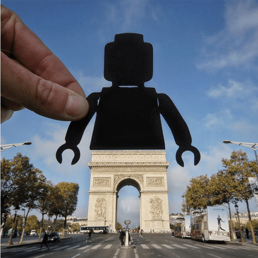
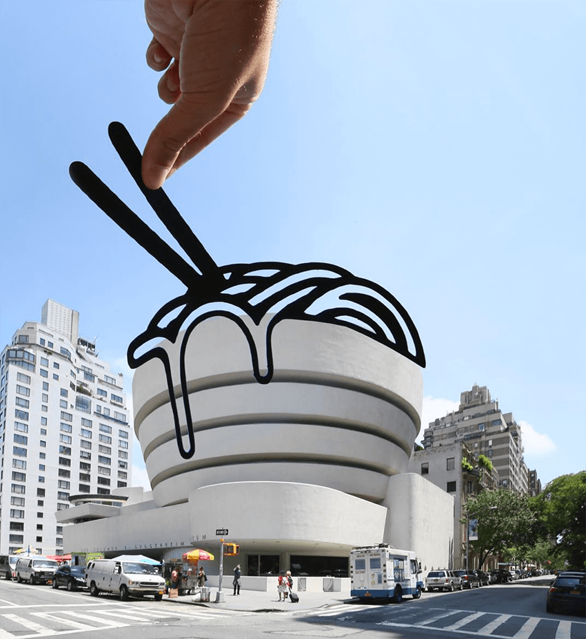
Rich McCor is the clever mind behind paperboyo, where he experiments with perspectives and paper cutouts so we can see iconic places in unexpected ways. He’s turned the Arc de Triomphe into a Lego minifigure, the London Eye into a bicycle wheel, and the Eiffel Tower into a water slide, just to name a few.
Rich’s inspiration for paperboyo came from seeing so many of the same images on Instagram. He told us: “I remember seeing Big Ben pop up on my feed a lot and got a bit bored of the same vantage points being used over and over”. Big Ben became his first project, he transformed it into a wristwatch.
Rich was also inspired by a fellow Instagrammer: “One of the first accounts I followed was @mattscutt, who is incredible at finding unique angles and perspectives on buildings. His style of photography made me think about exploring new angles and new vantage points. In the process of doing that you begin to see new shapes.”
While Rich’s images have a light, fun feel, a lot of work goes into finding unexpected angles and making them work. He pays close attention to finding the shoot locations and time of day, and he practice-doodles on printouts. But even then, things don’t always turn out, Rich estimates that for every ten ideas that go just right, two don’t pan out. He told us: “It can be a number of things, the wind, scaffolding on the buildings, shadows, etc. I’ve learned to get better at judging what will and won’t work before I travel and I’ve become more open to using Photoshop to manipulate my images. I mostly use it for focus blending”.
Through his work, Rich has discovered that a lot of people love to have their sense of perspective turned on its head:
People enjoy seeing the world in a new way. Someone described my photos as ‘smile-inducing’. That’s enough to make me want to keep on doing what I do.
Making the material part of the message
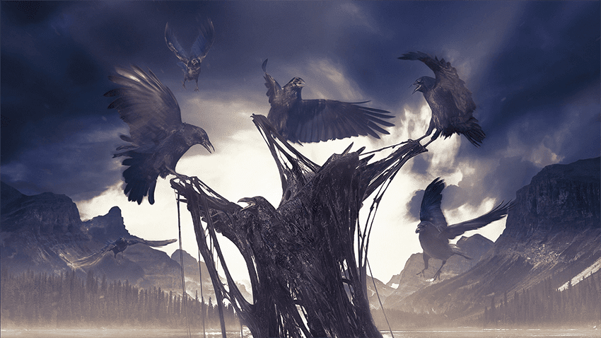
When it comes to adding an unexpected twist to a composition, designer Alex Palazzi is a master of materials. Some of you will remember our ‘Ones to Watch’ piece on Alex from a little while back – others can catch up on it HERE. Alex said on this topic: “I am always looking for material exploration in my work. I’ve used food, wax, plastics, and fabrics. It’s so interesting to play with materials that are really difficult to generate by computer like liquids, and viscous, sticky organics, and try to mix them to see what happens”.
With his approach to materials, Alex is able to create images that straddle the line between 2D and 3D. In a recent Adobe tutorial, he demonstrated how he designed a piece combining Adobe Stock images with his own photos of a homemade sticky substance. The substance, made with cheese, honey, and squid ink, lent a unique texture to the final product.
Sometimes, the results can be unsettling, like Alex’s series of letters. The font is Arial, the material is flesh.
All my life I have been a very slim guy but a few years ago I gained a lot of weight in a short period of time, so the inspiration for the project just came from the need to lose weight. I thought it would be a good idea to lose weight while making the letters to visualise font weights of the Arial typeface as human flesh. People’s reactions are different. Some people find it just gross, and some people find it grossly interesting – Alex Palazzi
When he’s perusing stock images for an unusual material or image to try out, Alex usually starts with an idea in mind, but sometimes an idea comes from the search itself. His best tip for finding unexpected inspiration? Instead of searching by subject, try looking by colour palette. And if you find an image you love but you want to transform the mood, Alex recommends some tweaking: “It’s all about Photoshop and colour grading. I use a lot of mixed colour lookups, LUTs, and blending mode colour brushes to change the mood dramatically”.
For more on artists whose work gets us thinking, read about unusual and unsettling compositions, take a look at portraits that break the rules, and visit this month’s curated gallery of beautifully unbalanced compositions in Adobe Stock.

