Let it Bleed: Shooting for Print Media with Chris Patmore
They said that video killed the radio star, and the web has killed the print industry. Or so we are led to believe. Here, Chris Patmore outlines everything you need to know if you’re hoping to see your photographs into printed publications
It’s true that the, once huge, circulations of the magazines that used to line high street newsagents’ walls have diminished, along with their advertising revenues. Quite simply, it’s because people no longer rely on print media for their information in the way that they once did.
For music photographers, this is extremely evident. The NME, as a publication, barely covers music anymore, never mind being the mouthpiece of the vanguard of rock and indie music.
Most of the glossy monthly music mags have fallen by the wayside too. There are a handful of free magazines, available from music venues, that still cater for fans who are interested in alternative and underground music, which, for the most part, are produced by volunteers and people who are passionate and happy not be paid, or to work for a fraction of what they may have been paid in the heady days of printed magazine dominance.
Blogs and online magazines are the places that people go to find out what is happening in the music [and pretty much every other] scene, now and, in the main, these too are run by volunteers. For photographers, they are both a vehicle for getting their hands on the elusive photo passes needed for pit entry, and [hopefully] a great way to get their work seen; the highly vaunted ‘exposure’, inevitably seems to hold more value than real cash for those that offer the space.
Apart from the lack of payment, there is another downside to shooting for the web only: the development of bad habits that don’t transfer well to the world of print, where there is still a chance of being paid.
This is also true for writers/journalists. I started working in the creative industries before digital took hold, and possibly before they were even called creative industries. As a graphic designer, everything was firstly visualised on paper, then you had to calculate the type size needed to fit the supplied words [also on paper] into space on the page. This would then be sent to the typesetters, who would send galleys of type set to your specification, which were then glued onto boards.
When the World Wide Web arrived. Most designers kept working with a page-format mentality, but we soon realised that those restrictions no longer applied
To include photographs, a box would be drawn on the board and either a sketch of the crop, or a photocopy of the image would be placed on an overlay so that the repro guy would know how big to scan the transparency or B/W print. Everything was designed to fit the page format, and we worked within those restrictions.
Then the World Wide Web arrived. Most designers kept working with a page-format mentality, but we soon realised that those restrictions no longer applied. Journalists could write as much or as little as they felt like, [although with most people reading on their mobile devices, brevity is the order of the day].
Also, with the web, there were no print costs to consider, which was the usual criterion for deciding a word count, and as connection speeds improved, more pictures, and ultimately, videos, could be added to pages without choking loading times; thus giving the reader an enriched experience.
Nowadays, with WordPress becoming the default method of building web magazines and blogs, horizontal/landscape photos are the preferred format, to fit in sliders and galleries.
Because so many of the people working in the concert/gig photography world have never had to shoot for print there are lots of things that they don’t take into consideration at the moment of pressing the shutter, which often makes their work unusable for print.
OK, if it is a stunning shot, then the picture editor and designer will find a way to make it work within the layout, no matter what. Along with general ‘rules’ such as avoiding ‘mic face’ and not cutting off the neck of the guitar, here are some points to consider.
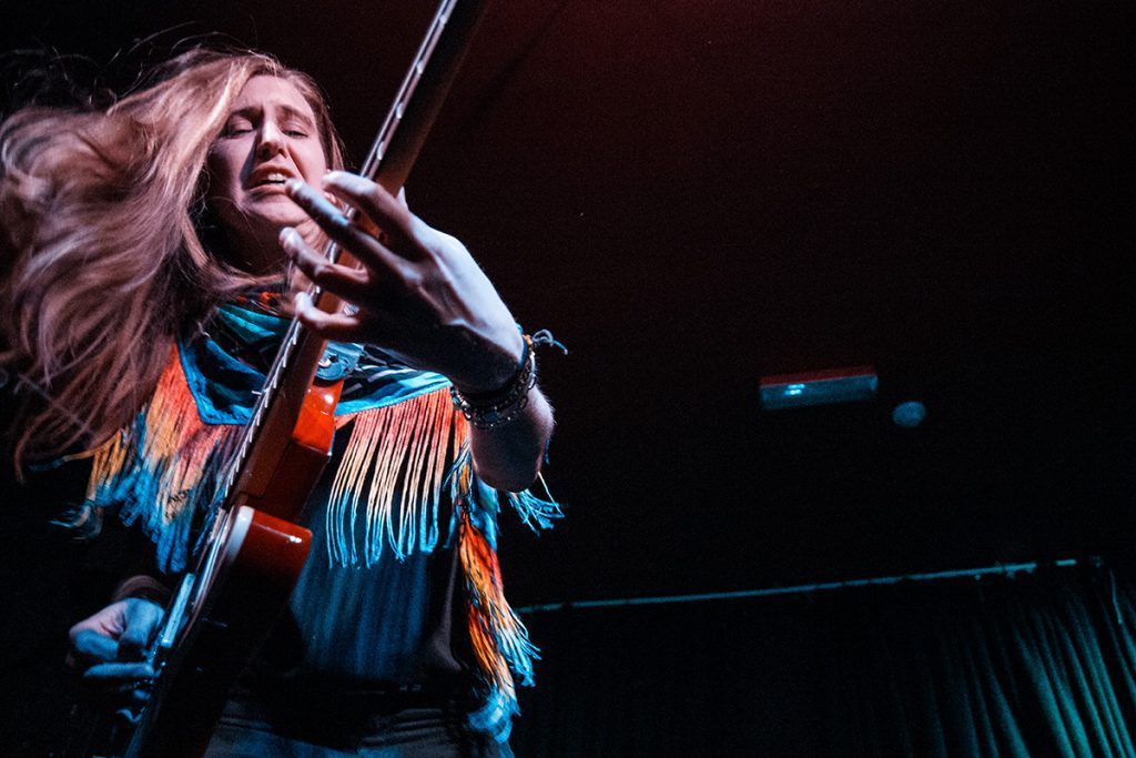
The full frame of the photo as taken
1. Don’t fill the frame/crop in camera. With all that is happening on stage, it is sometimes unavoidable if, say, the singer suddenly leans into the camera, or the guitarist does a spectacular jump in front of you. Ideally, you need to leave space around the action because:
- Not all magazine pages are the same ratio format as the camera’s sensor, which are either 3:2 [full-frame or APS-C sensors, and 35mm film] or 4:3 [Micro Four Thirds sensors or 645 film]. 3:2 is fairly close to A4 and 4:3 is close to the standard US format.
- If an image is going to presented full-page or double-page spread, an extra 3mm is needed on each edge of the photo, for what is known as ‘bleed’. This is printed outside of the final trim size of the publication, so that when the pages are printed and cut there is an allowance for slight paper movement, so as to avoid a thin white edge on the page. It is much easier to crop the image to size than it is to add more to it.
- As with page sizes, you don’t know what shape a designer will allocate for an image, which raises another issue; don’t send cropped, high-res images. Send the full frame and include a low-res crop/example of how you would prefer it to look. But you need to trust the art director/designer/picture editor know how to crop your image for their needs, especially if they are paying you to use it.
- Sometimes, text will be placed on your photograph, so it is better to leave some negative space around the subject to avoid it being positioned over the action.
- Try to avoid placing the action in the centre of the frame. If the photo is going to go on a spread you don’t want the subject’s face in the fold of magazine.

Cover from my zine, using the above shot. All the negative space on the right of the image made it easy to place the masthead, even in the chosen square format. It shows the bleed area outside of the page trim.
2. Shoot both horizontal and portrait images. Magazine pages are, ordinarily, portrait shaped. You are more likely to get a single page shot published than a spread, so if you want to get a cover shot, it will need to be shot in portrait format, and with plenty of space for the magazine’s masthead and cover lines to sit around it.
The image from a full-frame DSLR is likely to be large enough to cover a double-page spread, so, in theory, it will be possible to crop to fit the single page format; but if you can supply a full resolution portrait orientation shot, so much the better. Providing you leave enough space around the subject.
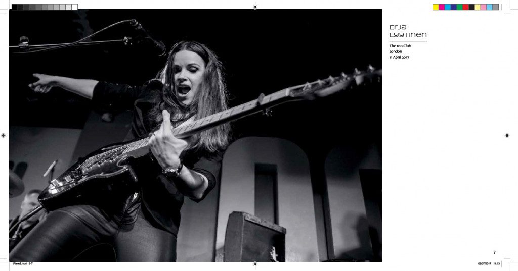
A double-page spread [DPS] that utilises the full image. The fold dissects the image in a non-critical place. Turning a black-and-white image from greyscale to CMYK, for printing in a full-colour magazine, will result in much richer tones than a straight greyscale image that just uses black ink.
3. There is still a fair amount of confusion about what constitutes a print resolution file. The term 300dpi is banded around a lot. DPI [dots per inch] is essentially a hangover from the pre-digital days of reprographics when different screens were used to prepare images for print. 300 dpi was used for high-quality reproduction in art books and magazines. Newspapers, on the other hand, would use almost half that number. It was calculated depending on the paper and inks used.
However, an image still needs an effective resolution of 300 dpi or ppi [pixels per inch] for quality printing. A 20 megapixel image measures 5472 x 3648 pixels, which is 193cm x 129cm at 72ppi or 46cm x 31cm at 300ppi.
The actual pixel area hasn’t changed, and that is the important measure. As long as the file is supplied at the size it was created, it doesn’t matter if it is 72ppi or 300ppi. I have a scanner for 35mm film that scans at 4000ppi. If I scan a 35mm slide at full resolution, I end up with a file that is 24mm x 36mm at 4000ppi, which is 5431 x 3551 pixels, or the equivalent of a 20 megapixel file.
In my work as a graphic designer, I can’t tell you the number of times I’ve been sent a full-page image at 72ppi, requested it to be resent as 300ppi for repro use, only to have the same file sent back, but with the resolution increased to 300ppi in Photoshop. All that achieved was to quadruple the size of each pixel. So basically, if you are sending an image to a magazine, send it at the full resolution it comes out of the camera. Don’t send the RAW file, and by all means colour correct how you want.
When the masthead and cover lines of a magazine are fixed, it is important to keep them in mind when composing the shot.
4. This raises another area of confusion. Working on the assumption that your monitor is correctly colour calibrated, and you have fixed the colours to your satisfaction [this is even more relevant to concert photography with the inevitable multicoloured lights] and you have a vibrant image that looks amazing on your Retina screen. Chances are you will be disappointed, though, when you see it in print.
Computer images [and that includes mobile devices] are, by default, RGB colour space. They use Red, Green and Blue to create the millions of colours and shades that we see, and lit from the back with tiny diodes, which is why they look so vibrant, especially the reds, blues and greens.
A printed image is made using Cyan, Magenta, Yellow and Black inks, commonly known as CMYK. The printed image is reflective, so you will not see those rich, vibrant colours that were on your HD monitor. It is possible to use additional special colour inks, but it’s not very common for magazines [with diminishing budgets].
It is also important not to confuse magazine printing, whether litho or digital, with photographic or inkjet giclee printing, which are completely different processes, that will closer match what you see on a screen. When sending files to a magazine for the first time, ask them for their image specs, in case they have certain requirements.
To briefly summarise the points to consider when shooting for print:
1. Shoot wider. It’s easier to crop than add to the image.
2. Consider the page format when composing the shot.
3. Be aware that onscreen colours are different to print ones.
All that’s left to do then, is to find a magazine that wants to use, and importantly, pay to publish your photographs.
About the author